" height="253.2480238095239px" id="Ps7e7nkBH" width="320.9215952380952px"/><path d="M 0 60.788 L 57.773 95.954 L 104.495 68.828 L 103.994 0 Z" fill="rgb(255, 255, 255)" height="95.95444047619047px" id="GI6IQNK9l" transform="translate(132.672 202.204)" width="104.49528571428569px"/></g></svg>)
MODAX

MDX_StackCards
Cinematic Presentation. Engineered Control.
Get MODAX updates
New components, tips, and discounts — straight to your inbox.
Core Capabilities & Features
✦
⚡Bilinear Physics-basedFramer Motion spring animations on every card transition. Drag inertia, threshold detection, and fly-off exit vectors feel native on any device.
✦
🎨 Theme-awareLight, Dark, and Auto modes. Auto follows the Framer site theme in real-time via MutationObserver — no manual toggling.
✦
📐 Fully TypedComplete TypeScript interfaces for all props, card items, and internal components. Full IntelliSense in Framer's code editor.
✦
♿ AccessibleARIA roles, keyboard navigation (Enter / Space), and focusable CTAs throughout. Meets the standards Framer's review team checks.
✦
📱 ResponsiveCards constrain to viewport width on mobile. Swipe threshold and font sizes scale proportionally with card width.
✦
🔒 SSR-safeAll browser-only APIs (window, document, ResizeObserver) are guarded. The component renders safely in server-side contexts.
✦
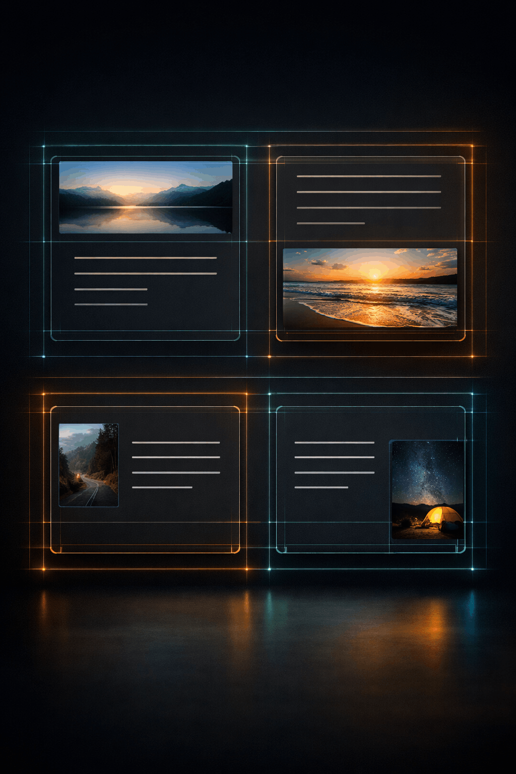
Swipe InteractionThe top card responds to drag gestures in all four directions — left, right, up, and down. A configurable threshold determines when a drag becomes a swipe. Once the threshold is crossed, the card exits with a physics-driven fly-off animation in the direction of the drag. The deck cycles endlessly — swiping the last card brings the first back to the top.
✦
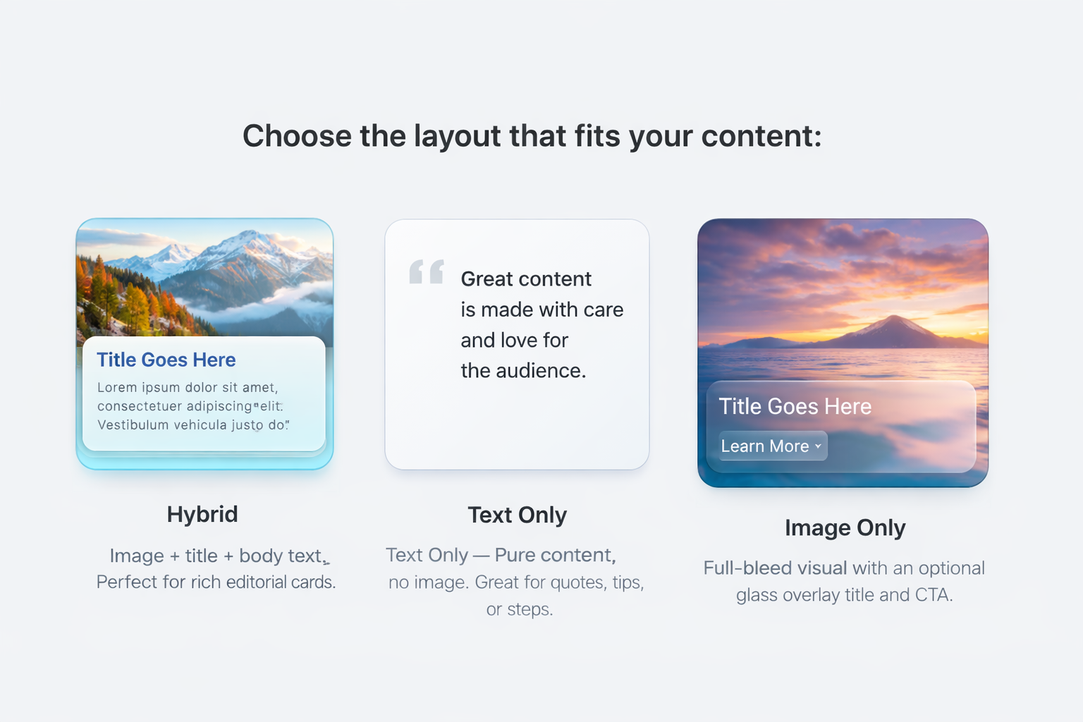
Three Card TypesEach card in the deck can independently use one of three layout types:
Hybrid — Full image with title and body text, configurable layout direction
Text Only — Pure typography — title and body text, no image
Image Only — Full-bleed image with an optional glass-morphism overlay for the title and CTA
✦
Image ControlsHybrid and Image Only cards expose five independent image controls per card:
Source — Upload from Framer's asset panel or supply a remote URL
Fit — Cover fills the frame. Contain shows the full image with letterboxing
Position — 9 focal point presets to keep subjects in frame as card dimensions change
Zoom — Scale factor from 0.5× to 3× for fine-grained crop control
Layout Direction — Image Top, Bottom, Left, or Right relative to text content (Hybrid only)
✦
Rich Text FormattingBody text supports an inline markdown subset. No HTML, no code — just plain text with simple markers that render as formatted output on the card. See Section 5 for the full syntax reference.
✦
Call-to-Action ButtonEvery card supports an optional CTA button with two navigation modes. URL mode opens any link in a new tab or the same tab. Section mode smoothly scrolls the page to any element by its HTML ID — ideal for connecting card content to sections of the same Framer page.
✦
Theme SystemThree theme modes — Light, Dark, and Auto. Auto mode uses a MutationObserver on the document body to detect when the Framer site theme changes and updates all card colours instantly without a re-render cycle. All colours are driven by CSS class selectors, not inline styles, ensuring correct cascade in all Framer theme contexts.
✦
Solo Design ModeA designer-exclusive mode that renders a single isolated card at a specified index directly on the Framer canvas. Eliminates the need to swipe through the deck to inspect or adjust individual cards. A red badge confirms the mode is active.
✦
Visual DNAA centralised property group controls the physical dimensions that apply to every card in the stack: width, height, corner radius, and deck spread behaviour (fan vs. flat stack). Change once — all cards update.
Elevate Your Canvas
Ready to transform your site’s user experience and eliminate scrolling fatigue for good?
The MDX_StackCards is more than just a UI component—it is a conversion-driven layout engine designed for designers who refuse to compromise on performance or aesthetics. By integrating this bilinear, aspect-ratio-stabilized deck into your project, you provide your audience with a tactile, engaging way to explore content that feels natural on every device. Stop settling for static lists and start building immersive interfaces that captivate and retain.
Get MODAX Releases First
Early access to components, templates, and plugins — plus exclusive freebies and limited-time discounts.