






Architectural Lines
Now Showing

Architectural Lines

MDX_CineGallery

V1.0.1
A cinematic image gallery for Framer with an adaptive 3D Cinema Rail, effortless image swiping, and an elegant Theater Mode that puts every photograph first.

Overview

Most image galleries force a choice between a large viewing area and convenient navigation. MDX_CineGallery brings both together in one responsive experience. A spacious image stage showcases the selected photograph, while a true 3D Cinema Rail makes the rest of the collection easy to explore.

On wider components, the rail sits beside the image and can collapse to give the artwork more room. On narrower components, it becomes a horizontal 3D drum beneath the stage. Visitors can also swipe or drag directly on the main image, use a horizontal trackpad gesture, or open the distraction-free Theater Mode without losing their place.

Designed for expressive visual portfolios and practical image collections alike, the gallery pairs Smart Fit framing, image-aware ambient lighting, responsive typography, and restrained glassmorphic controls with straightforward Framer configuration.

Portfolio

Photography Collections

Present editorial and portrait work with focused viewing and effortless image-by-image browsing.
Architecture

Project Showcases

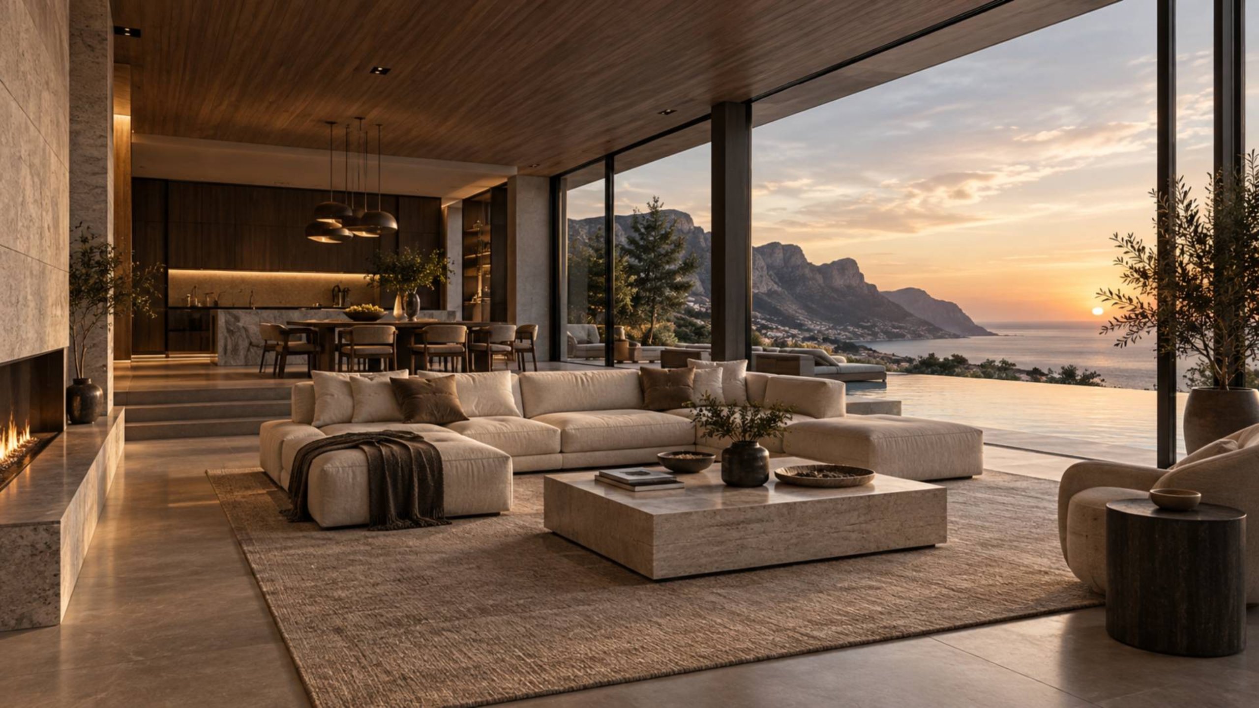
Give interiors and architectural photography a generous stage with visual collection navigation.
Fashion

Editorial Lookbooks

Create a cinematic journey across campaign visuals and product styling.
Creative Studio

Case Study Galleries

Combine visual storytelling with direct access to individual images.
Product Design

Visual Presentations

Showcase product renders and detail shots without sacrificing navigation space.

Why Choose MDX_CineGallery

POINT 01
More image. Less interface.
Collapse the side Cinema Rail when visitors want a larger viewing area while keeping direct image swiping available.
POINT 02
Navigation that adapts to the design.
One gallery switches between a vertical 3D rail and a classic bottom drum based on component width rather than assuming a fixed screen size.
POINT 03
A complete viewing experience.
The image stage, Cinema Rail, title, editable counter, and Theater Mode stay synchronized as visitors browse.
POINT 04
Premium by default.
The gallery arrives with a dark elevated appearance and a curated six-image sample collection; designers can refine the essentials without managing dozens of settings.

Features Stage

🎞️

Adaptive Cinema Rail

Display a vertical 3D image selector beside the stage or a horizontal drum beneath it.

Ideal For

AUDIENCE 01
Photographers and artists
who want their work to remain the focus rather than the gallery controls.
AUDIENCE 02
Architecture and interior studios
showcasing collections where composition and viewing space matter.
AUDIENCE 03
Fashion and creative agencies
building immersive lookbooks and image-led case studies.
AUDIENCE 04
Framer designers
who need a configurable reusable gallery with an integrated mobile experience.

Properties Gadget

Navigation & Viewing Experience

FORMAT 01
Auto Cinema Rail.
At 720px component width or wider the 3D selector moves to the side; below that width it becomes a bottom drum. This is the default and the recommended setting for most layouts.
FORMAT 02
Side Cinema Rail.
Use a vertical 3D rail on sufficiently wide components. Choose Left or Right and let visitors collapse it when they want more image space. Side still falls back to Bottom below 720px.
FORMAT 03
Bottom Classic.
Keep the horizontal 3D drum underneath the image at every supported width. This is useful for narrow page sections or designs that favor a vertically stacked composition.

Image Stage

Swipe or drag left for the next image and right for the previous image. Horizontal trackpad gestures also navigate. Vertical gestures remain available for normal page scrolling.

Cinema Rail

Drag the 3D cards, select a thumbnail, use the navigation arrows, or scroll over the rail with a mouse wheel or trackpad. The marquee and image stage update to the selected item.

Theater Mode

Open the image using the expand control. Theater Mode keeps the entire image visible with its controls outside the picture. Desktop and tablet display external side arrows and an information dock below the image; narrow screens place arrows in the dock alongside the title and editable counter. Swipe, drag, horizontal trackpad gestures, and keyboard navigation remain available.

User Guide

Step 1 of 520%

Add the component:

Insert MDX_CineGallery into a Framer page and size it for the intended layout.

Interaction Reference

In the Gallery

- Select an image by clicking or tapping its 3D card. - Drag the main image horizontally or use a horizontal trackpad gesture to move between images. - Click the image counter to enter a target image number and jump directly to it. - Use the expand control to open Theater Mode. - Use the side-rail toggle to collapse or expand the rail when Side mode is active.

With a Keyboard

- On the focused Cinema Rail use Left and Right arrows for navigation; in side mode Up and Down also work. - Use Home or End on the focused rail to select the first or last image. - Focus an individual rail card and press Enter or Space to select it. - In Theater Mode use Left and Right arrows to navigate and Escape to close the viewer. - When editing the counter press Enter to apply the number or Escape to cancel editing without closing Theater Mode.

Let the images take center stage

MDX_CineGallery combines cinematic presentation with practical navigation in a single responsive Framer component. A collapsible 3D Cinema Rail and swipe-ready image stage make browsing natural while premium Theater Mode presents every image without controls covering the artwork.
✓ Adaptive side or bottom Cinema Rail
✓ Image-first Theater Mode
✓ Swipe drag and trackpad navigation
✓ Smart Fit and direct image jumping
✓ Minimal typography and RTL controls

FAQ

Image Sources & Troubleshooting

Image does not appear

Framer Marketplace review requirements limit this component to Framer-managed image sources and configured MODAX R2 demo sources. Use Framer Image for creator-uploaded media. MODAX R2 URLs must match the configured host and bucket path and serve publicly readable image data. R2 S3 API URLs generally need authentication and should not be used as public image-delivery addresses. A valid URL still needs to return a decodable image.

Framer Marketplace image-source requirements

Framer Marketplace review requires this component not to load arbitrary creator-configured third-party image URLs in visitors’ browsers. For your own images, choose Framer Image to use Framer-managed assets. MODAX R2 URL is reserved for configured MODAX-hosted demonstration images. A valid Framer image takes precedence. The six original sample images use the configured MODAX public R2 demonstration host. The source limitation follows Framer Marketplace review guidance for this component.

Ambient glow does not match an external image

The gallery samples image colors using a canvas when the image host permits cross-origin pixel access. If that sampling is blocked or fails the image can still display and the component uses its fallback glow.

Navigation behavior feels different across devices

The Cinema Rail changes axis with its layout. Side uses vertical 3D movement and Bottom uses horizontal movement. Main-image navigation stays horizontal in either mode; vertical touch gestures on the image remain page scrolling.

Quick Decision Guide

Choose MDX_CineGallery when
Your Framer site needs a large image presentation combined with an expressive 3D navigation system and a polished full-image viewer.

Use Auto when: You want a single responsive component that can adapt between a side Cinema Rail and a horizontal bottom drum.

Use Bottom when: Your page composition benefits from a stacked gallery even on wider screens.

Get MODAX Releases First

Early access to components, templates, and plugins — plus exclusive freebies and limited-time discounts.


MODAX
Components
Templates
Plugins
Privacy
Terms & Condition
Return Policy
Contact Us

Create a free website with Framer, the website builder loved by startups, designers and agencies.