" height="253.2480238095239px" id="Ps7e7nkBH" width="320.9215952380952px"/><path d="M 0 60.788 L 57.773 95.954 L 104.495 68.828 L 103.994 0 Z" fill="rgb(255, 255, 255)" height="95.95444047619047px" id="GI6IQNK9l" transform="translate(132.672 202.204)" width="104.49528571428569px"/></g></svg>)
MODAX
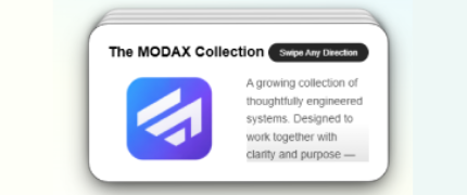
MODAX Library
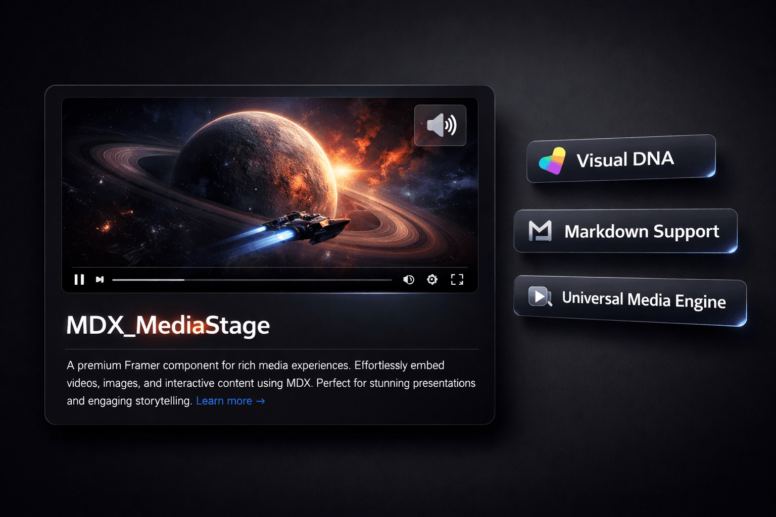
MDX_MediaStage
v1.0.0Unified intelligence for rich media content
MDX MediaStage is a premium Framer component by MODAX — a flexible content stage designed for media, headlines, and calls to action. It unifies YouTube, Vimeo, native video, and image media behind a single intelligent interface, with a composable layout system that lets designers build any card variation without writing code. Every section of the card — Media, Title, Body, CTA, and Footer — can be toggled on or off independently from the property panel. This produces 32 distinct layout combinations from a single component instance.
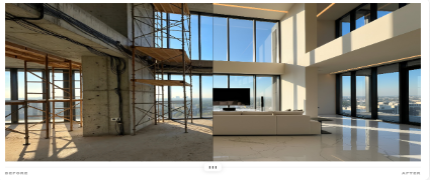
MDX_BeforeAfterSlider
v1.0.0Cinematic image comparison via draggable slider
MDX Before / After Slider is a premium drag-to-reveal image comparison component built exclusively for Framer. It is the only before/after slider on the Framer marketplace with dual-axis orientation — vertical (left/right drag) and horizontal (top/bottom drag) — making it the most versatile and semantically correct comparison slider available. Designed for agencies, freelancers, and studios who need a production-ready showcase card — not just two images and a line — the component includes a complete content layer system, scroll-triggered reveal animation, swipe momentum physics, three handle styles, badge labels, and automatic dark mode. Every feature is configurable from the Framer property panel without touching code. Semantic correctness: At 0% the Before image is fully visible. At 100% the After image is fully visible. The slider rail thumb and the image split line are always in perfect sync in both orientations. This is the correct behavior — and it is not what most sliders on the market do.

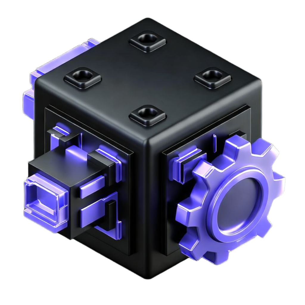
MDX_BentoGrid
v1.0.0Pinterest-style media organization with smart playback
MDX BentoGrid is a premium Framer component for showcasing AI-generated images and videos in an intentional, editorial bento layout. Every tile is precisely placed using column and row spans, and that designer intent is preserved identically across all screen sizes, from widescreen desktop down to mobile. Built for AI media creators, design studios, and anyone who needs a gallery that feels curated rather than generated.
MDX_DocMenu
v1.0.0Interactive dock navigation with dynamic magnification
MDX_DocMenu reimagines web navigation by eliminating the traditional navbar in favour of a compact, interactive dock inspired by Apple's macOS design language. The 3D prism tray is the centrepiece — it auto-sizes to fit the number of icons provided, gracefully switching to masked horizontal scroll when space is constrained, while keeping the full tray visible at all times. Icons magnify dynamically as the cursor approaches, providing satisfying visual feedback. Each item can navigate to an external URL, an internal Framer page, or scroll smoothly to a target section on the current page — making the component equally at home as a site-wide navigation bar or a single-page section controller.
MDX_StackCards
v1.0.0Engaging swipeable stack for content discovery
MDX Stack Cards is a production-ready Framer component that transforms static content into a dynamic, tactile stack of swipeable cards. Powered by Framer Motion's physics engine, every swipe feels real — cards fly off the stack with natural inertia and the next one settles in with a spring. The component is built to disappear into your project. Drop it on the canvas, replace the default content, and publish. No configuration files, no external dependencies, no setup friction.